FAB (Yoopies) Responsive eCommerce UX/UI Design

Challenge
FindABabysitter.com (now Yoopies) faced a challenge of low conversion rates despite their rapidly growing user base. Their ecommerce journey was complex and outdated, resulting in increased cart abandonment rates. Additionally, their design lacked cohesion, leading to multiple user complaints.
Solution
Initially, identified the bottleneck of cart abandonments and defined key User Personas. Then designed a user-friendly, responsive eCommerce User Experience to boost conversion rates. As evidence of successful Conversion Rate Optimization and a seamless User Experience, FindABabysitter was acquired by Yoopies. Additionally, a concept User Interface was created for an LEDU course.
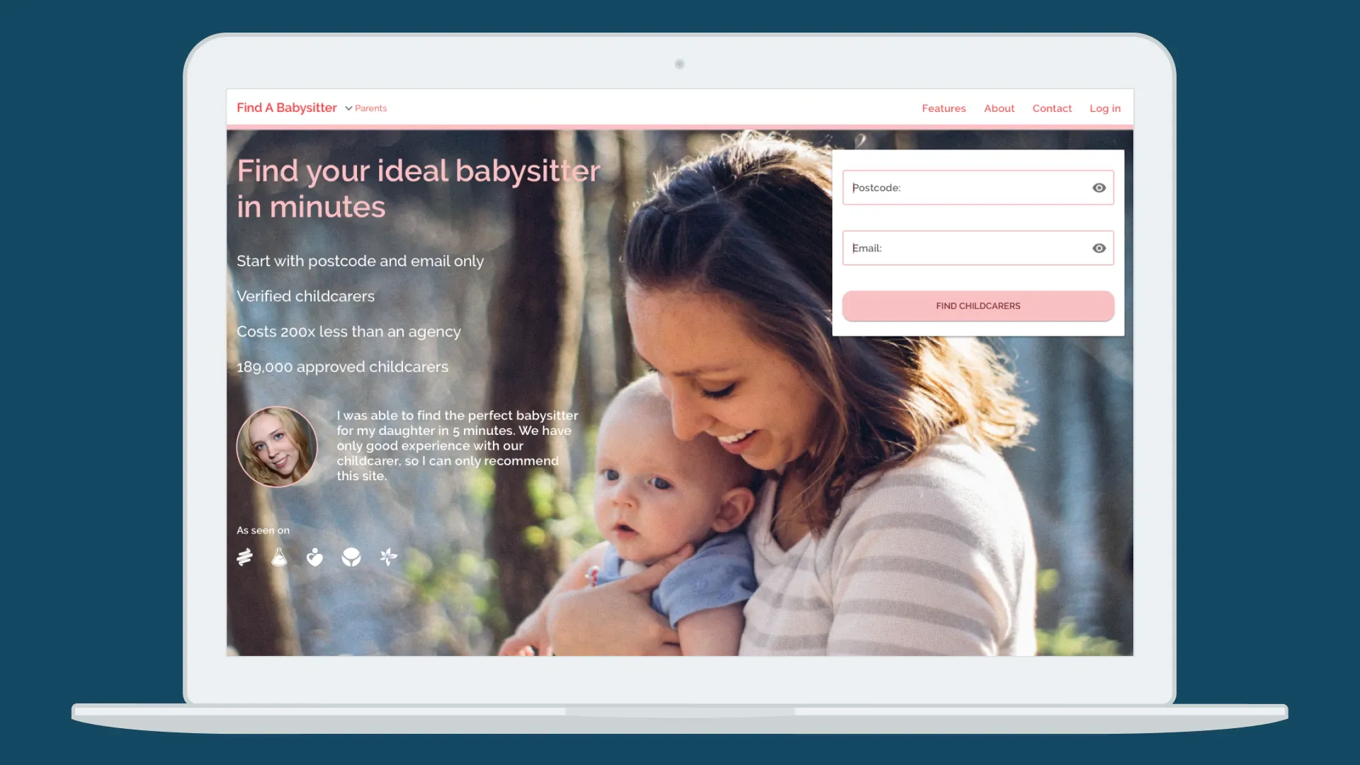
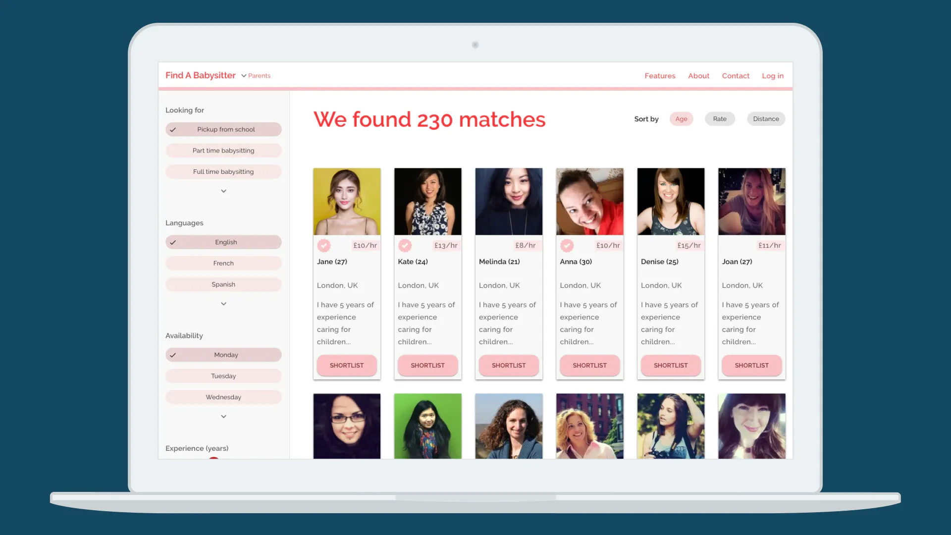
UI / Desktop

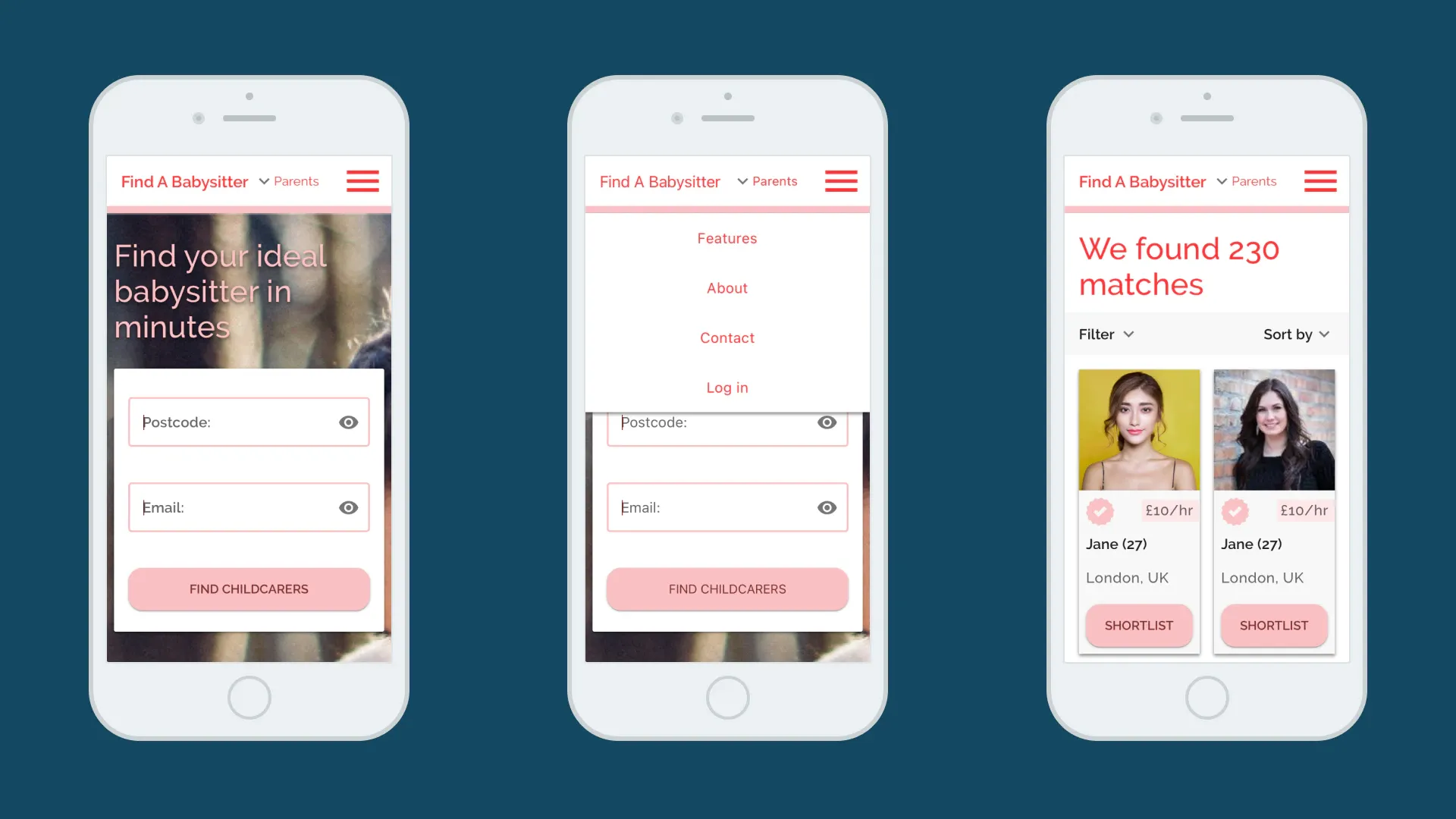
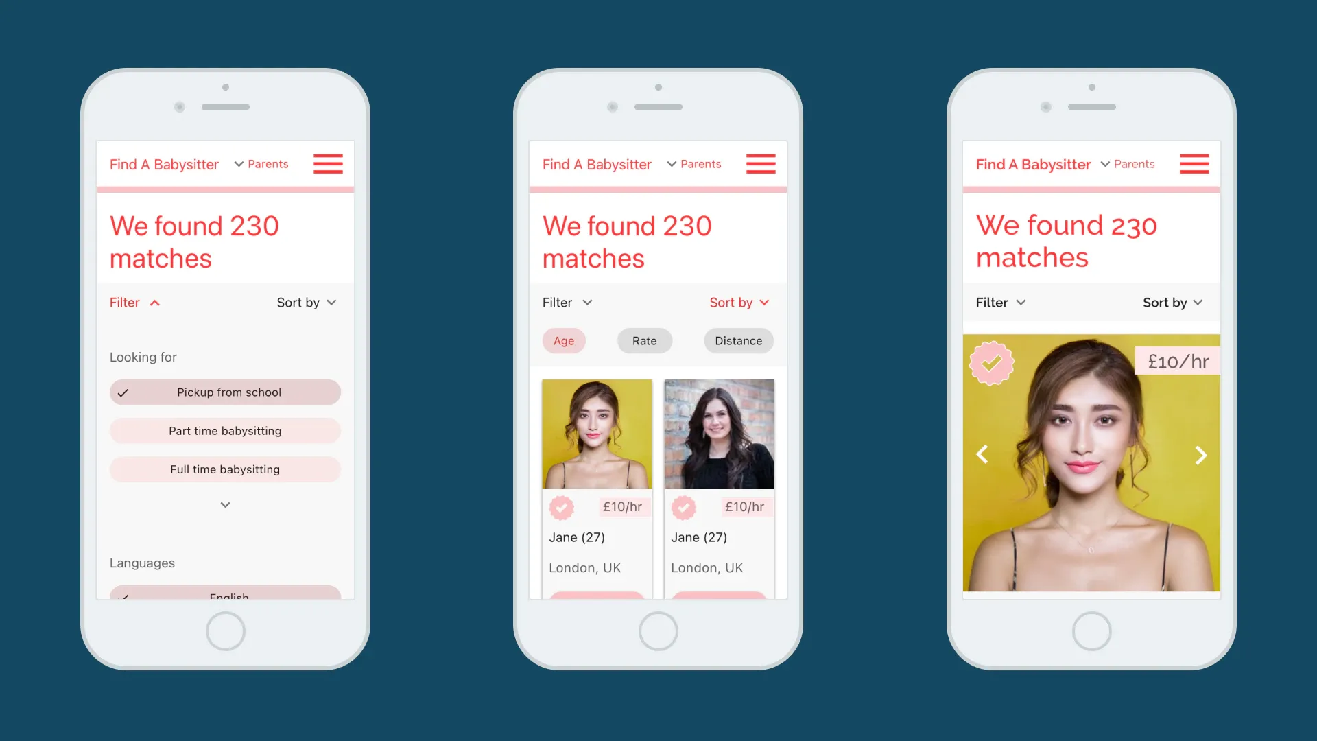
UI / Mobile
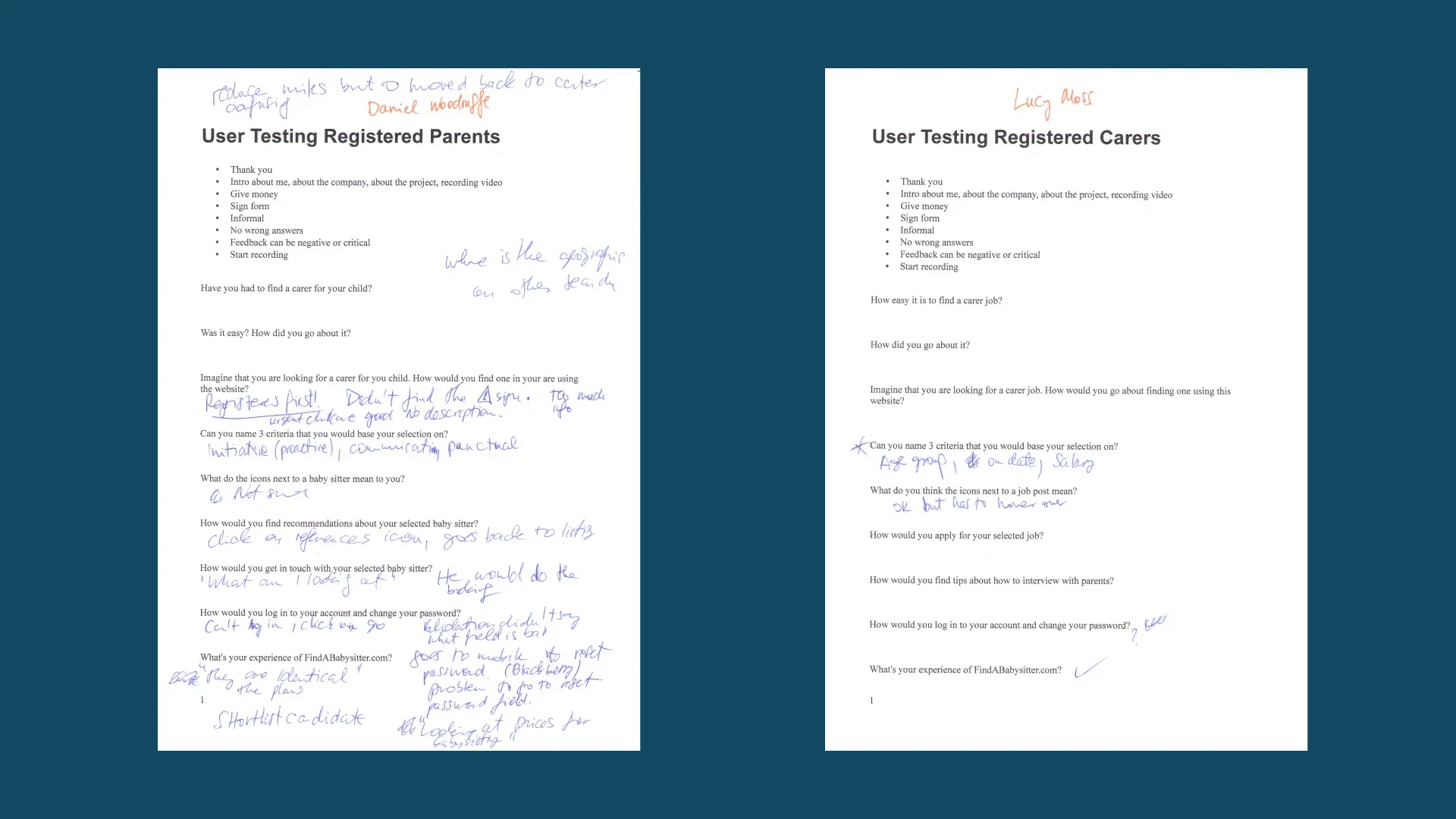
UX / User Research / User Testing
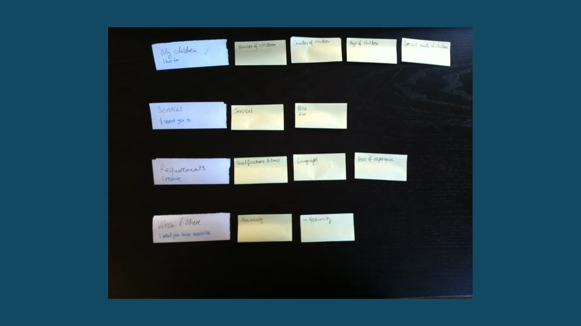
UX / User Research / Card Sorting
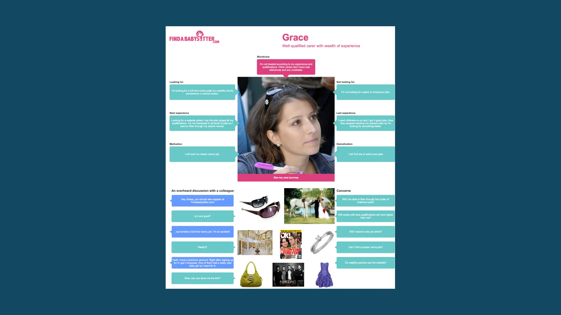
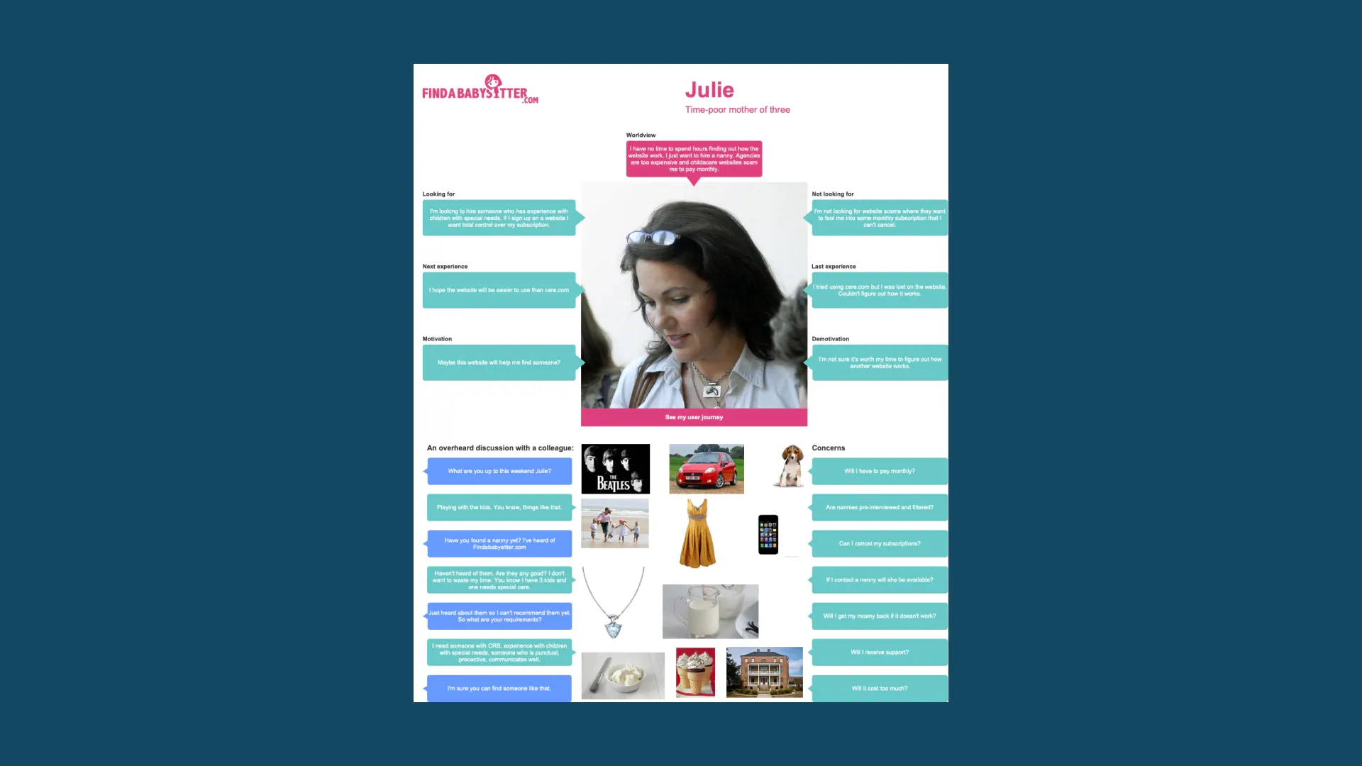
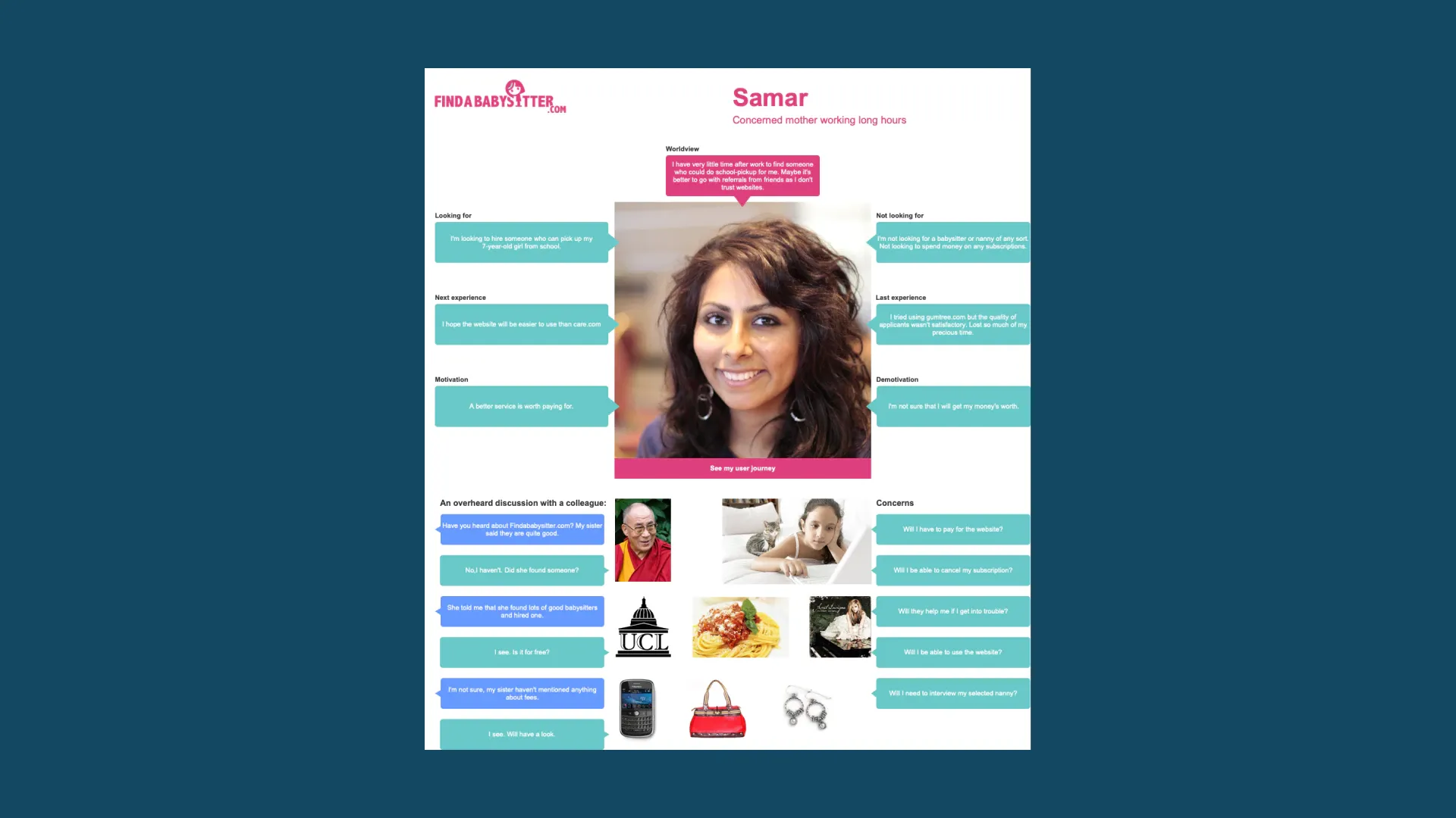
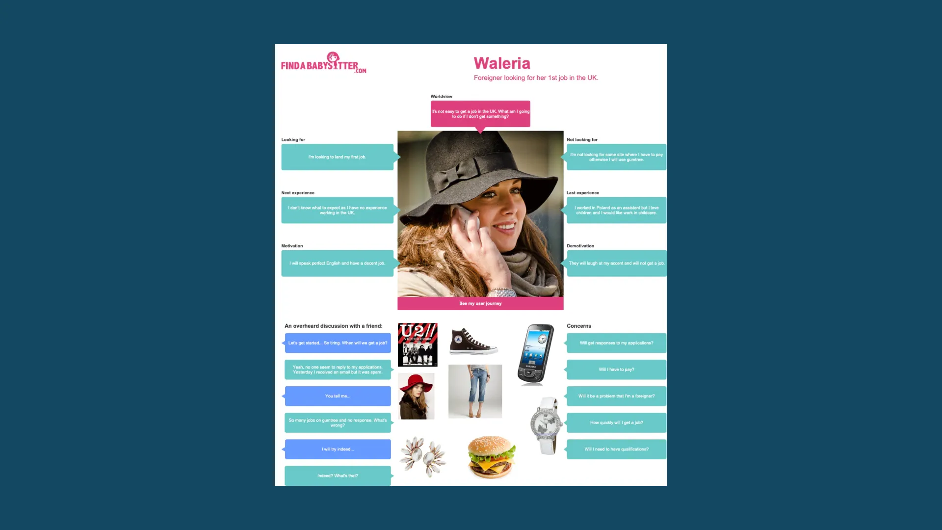
UX / User Research / Personas
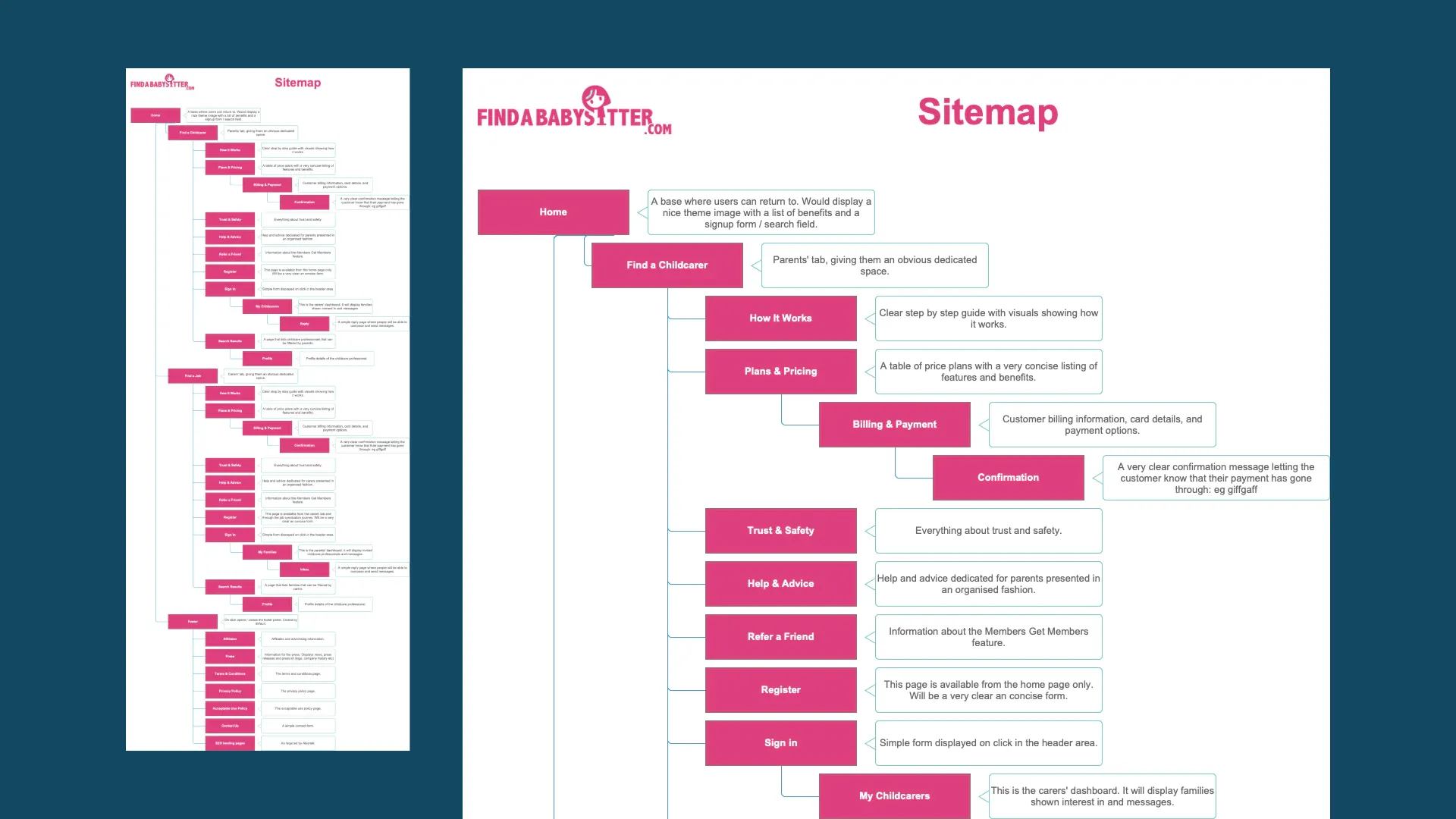
UX / Sitemap
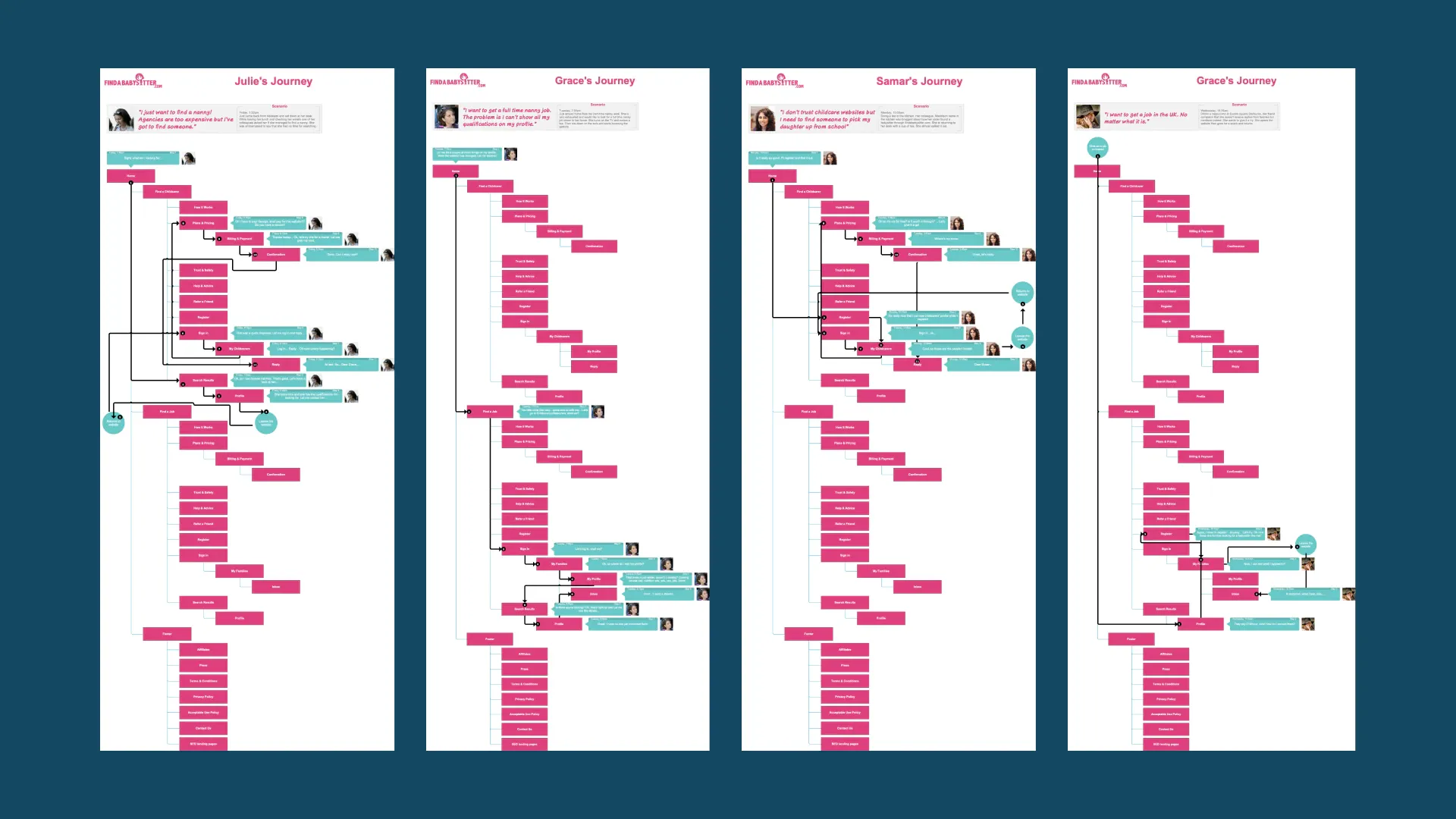
UX / User Journeys
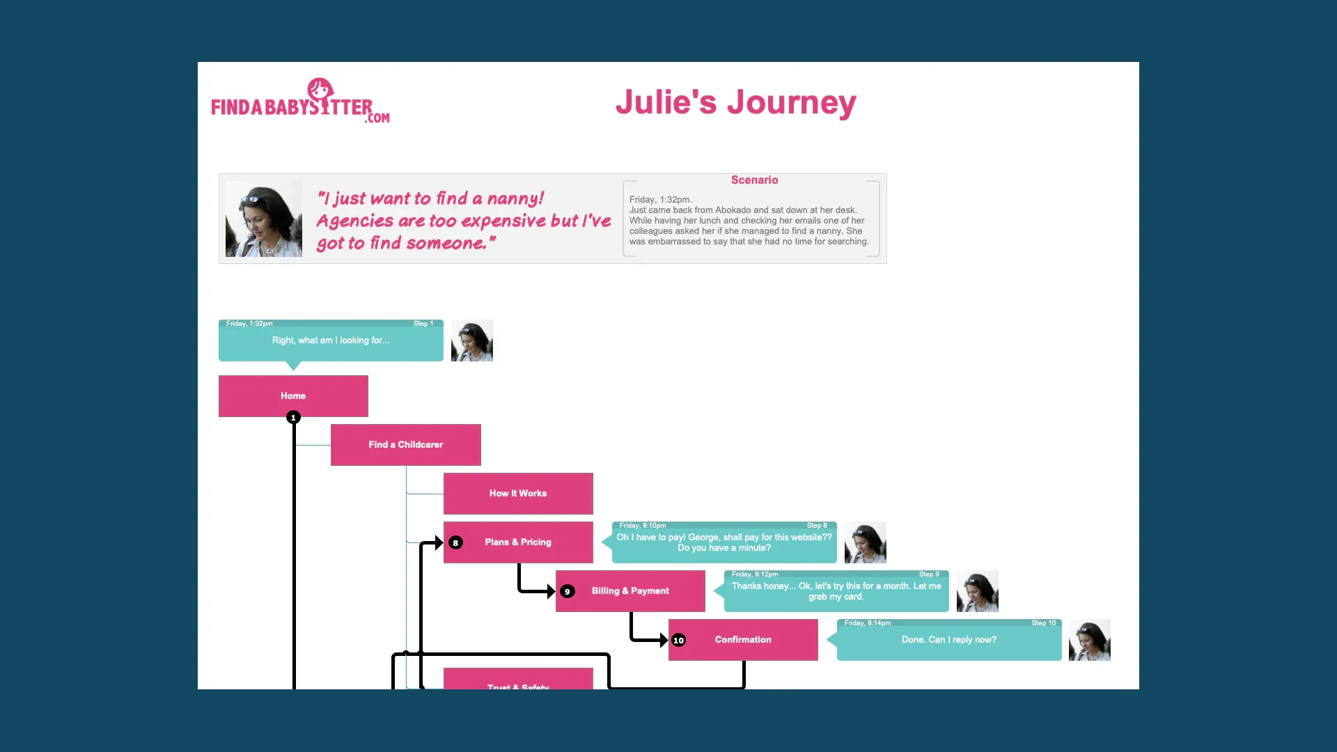

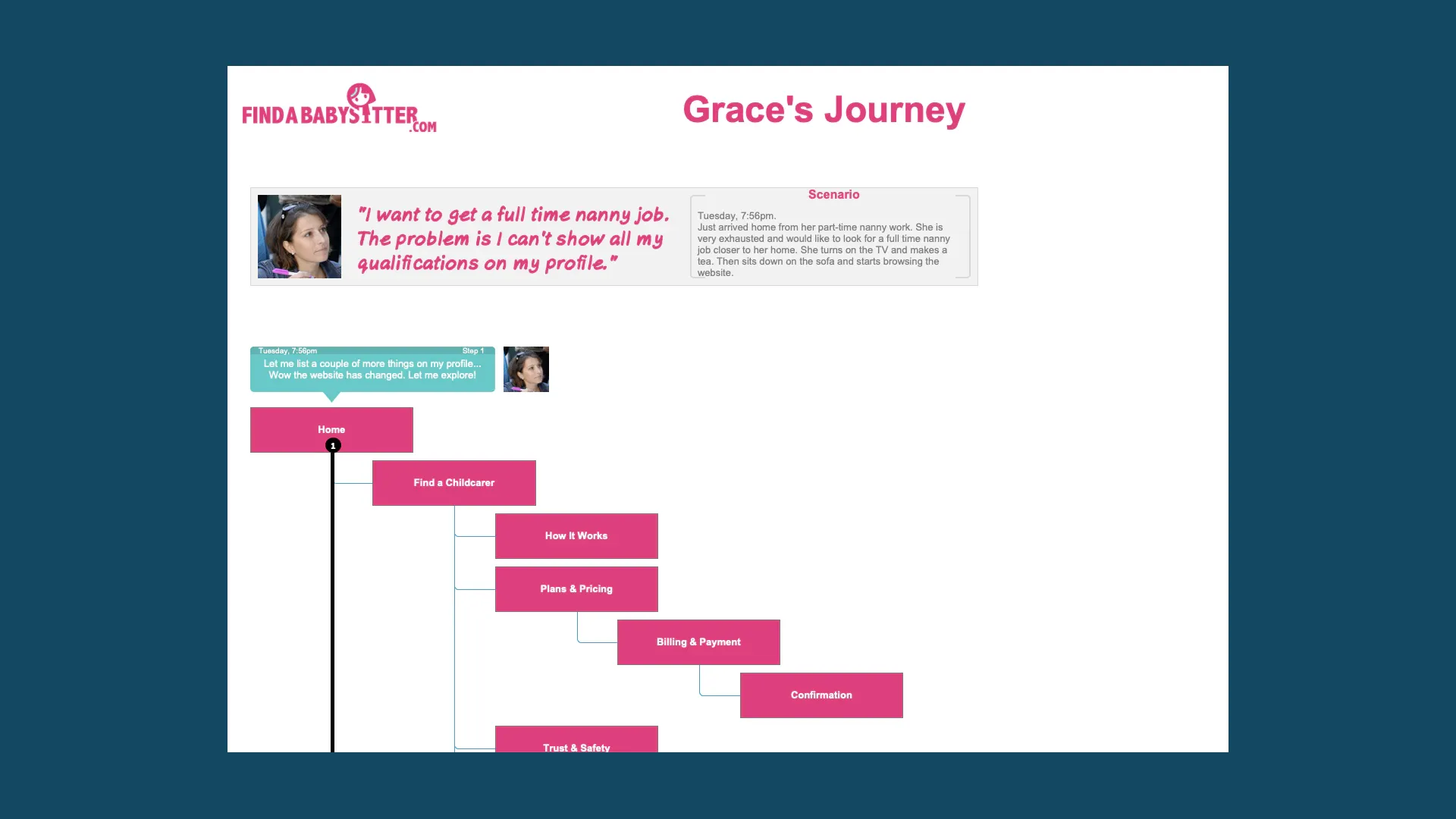
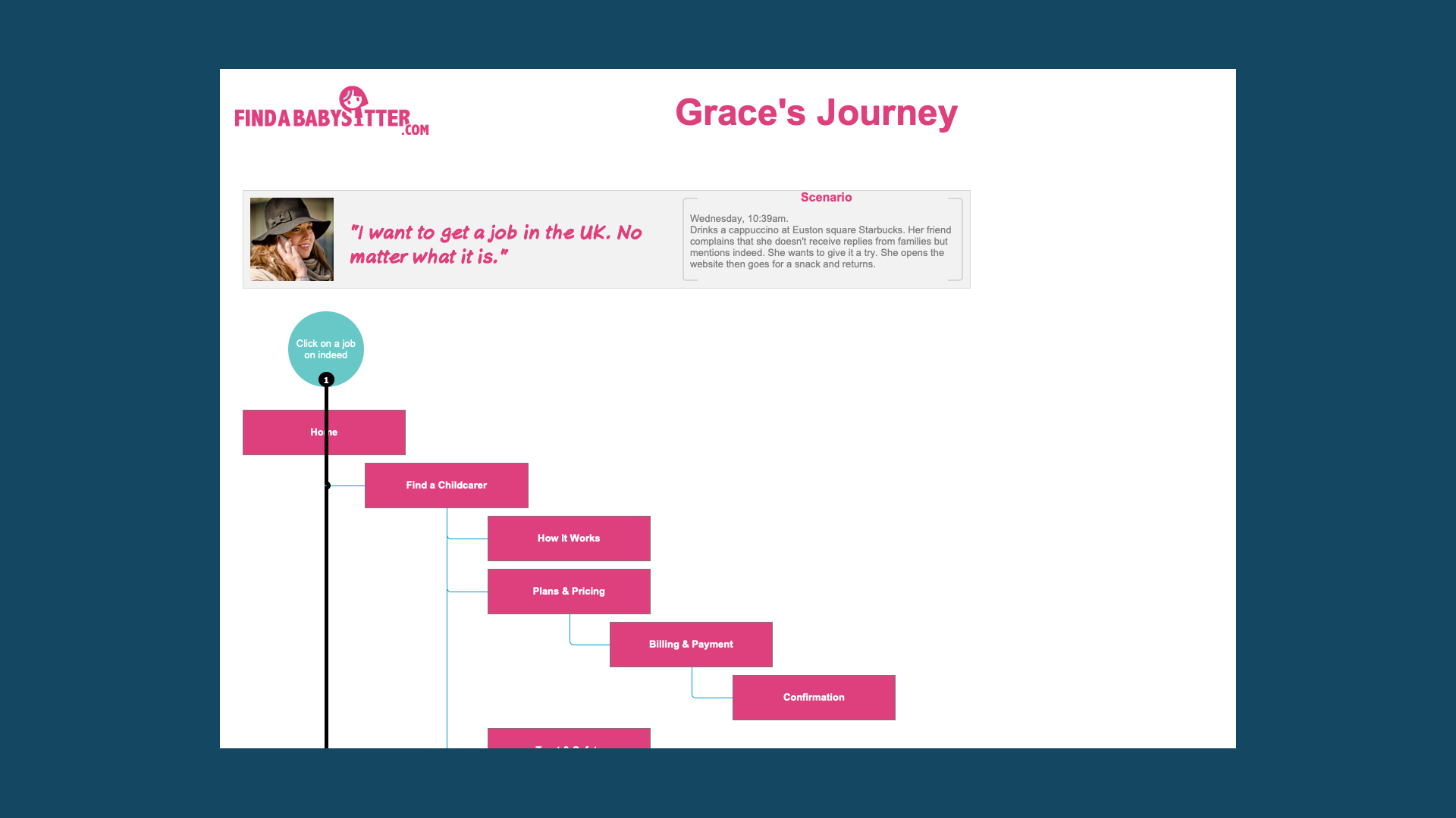
UX / User Flows
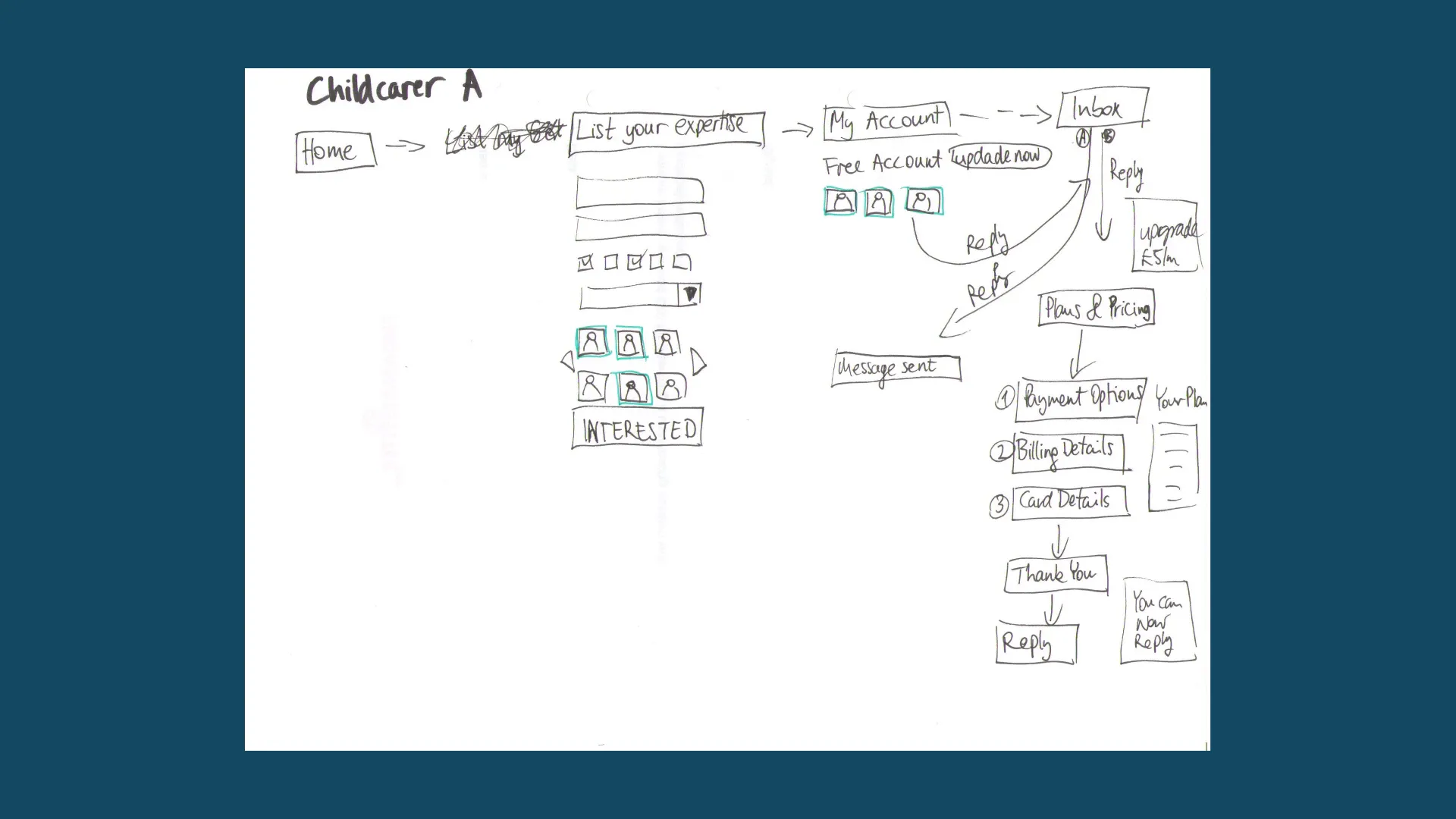
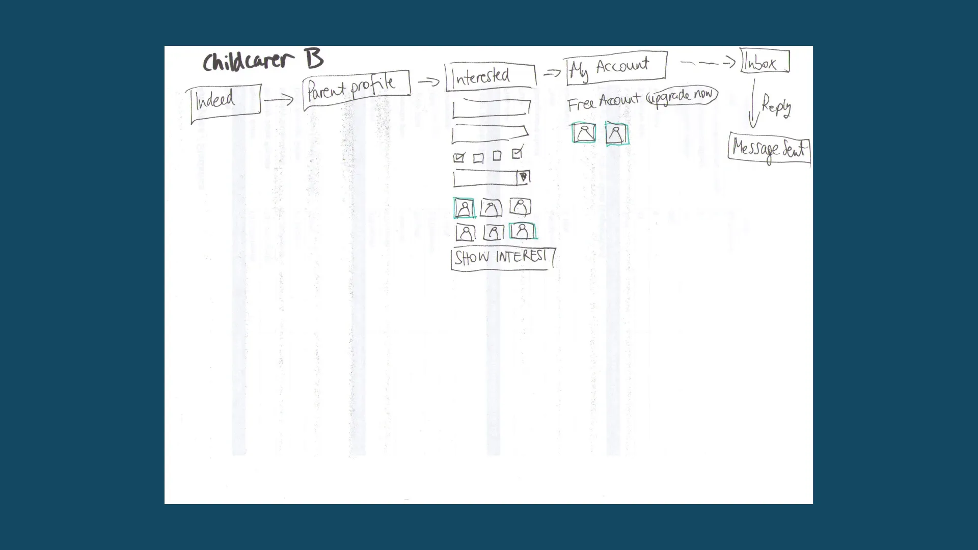
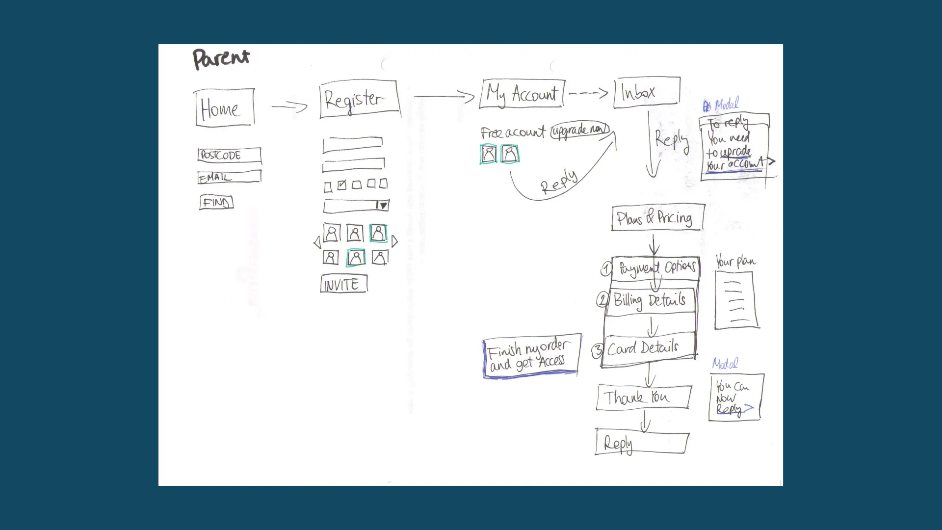
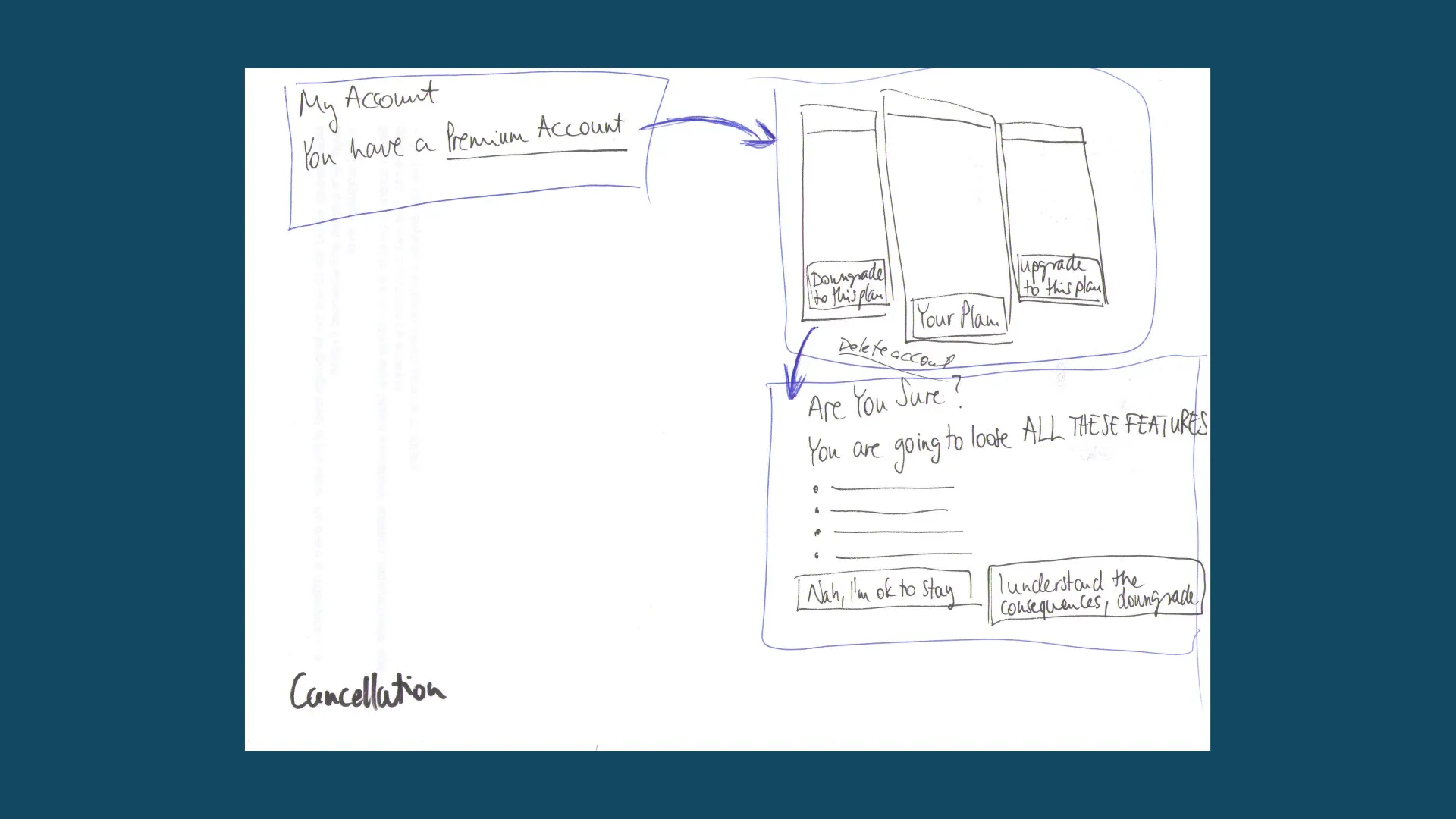
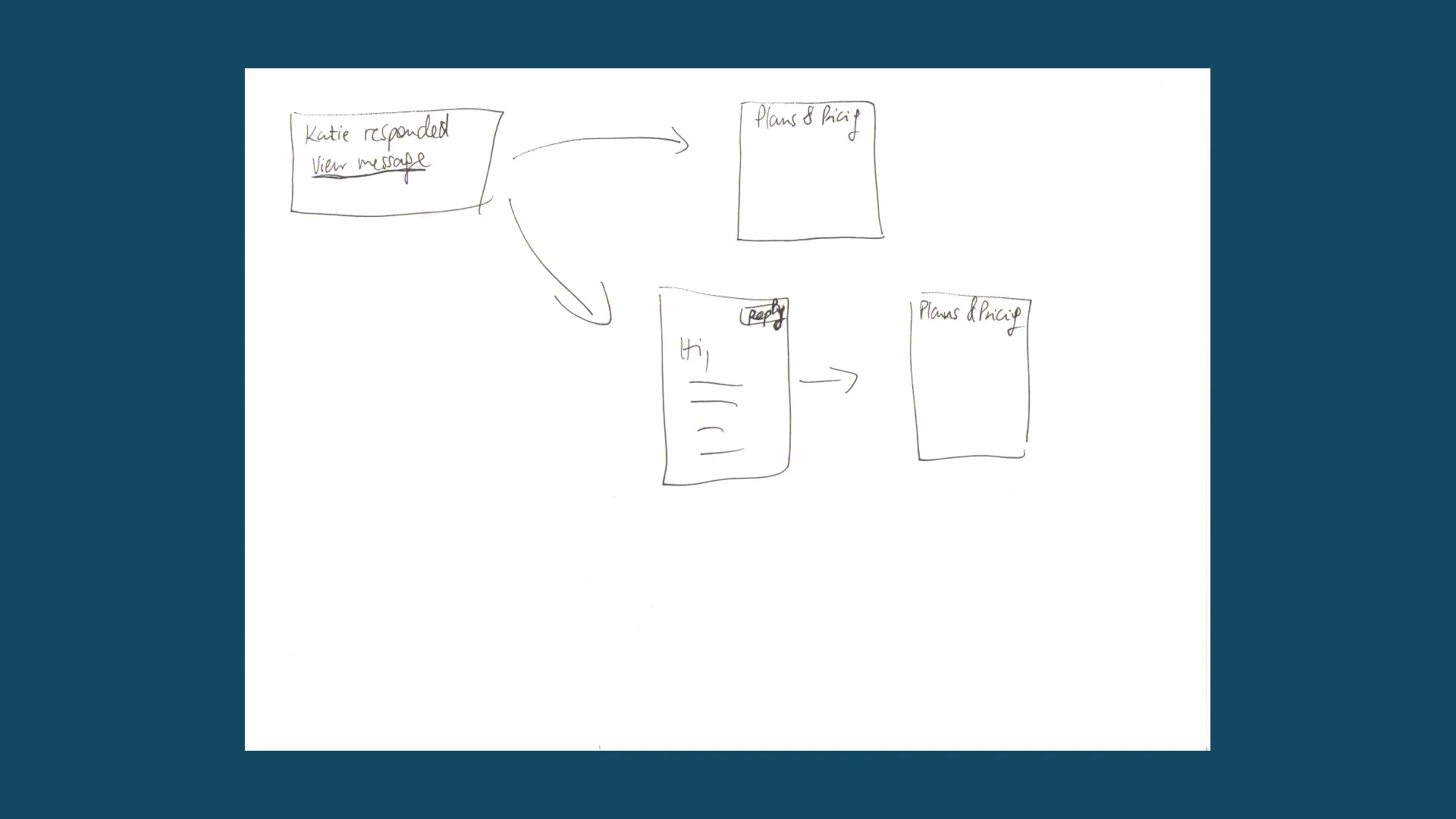
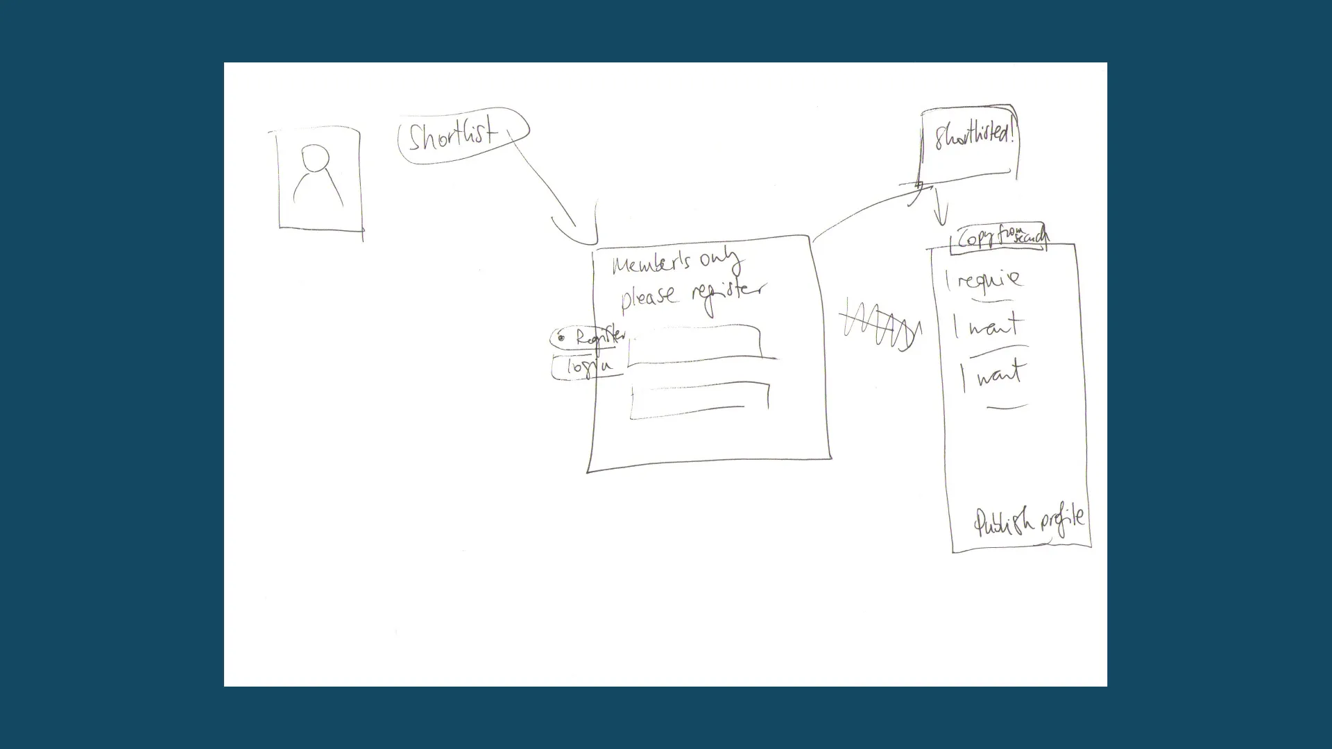
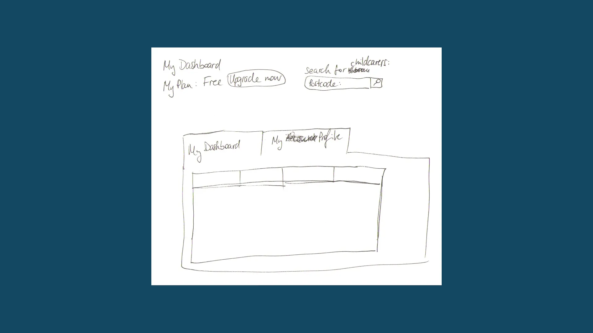
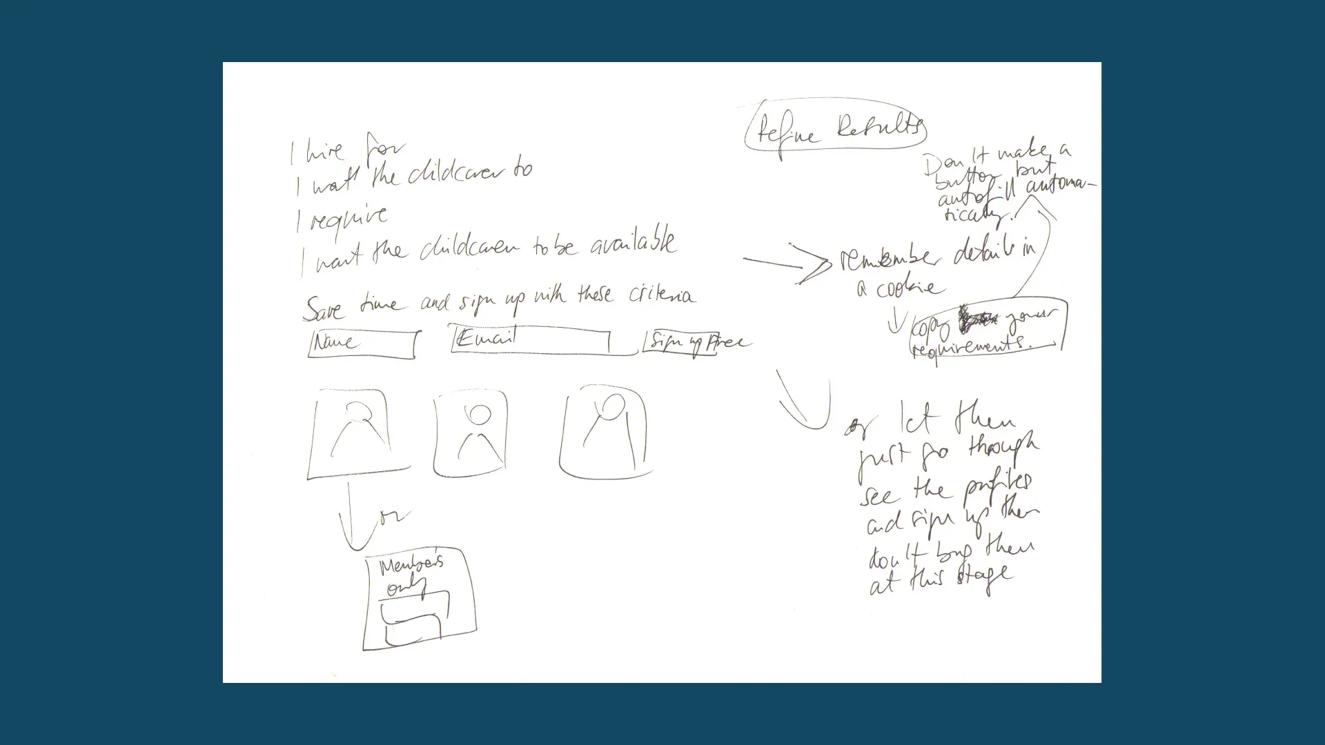
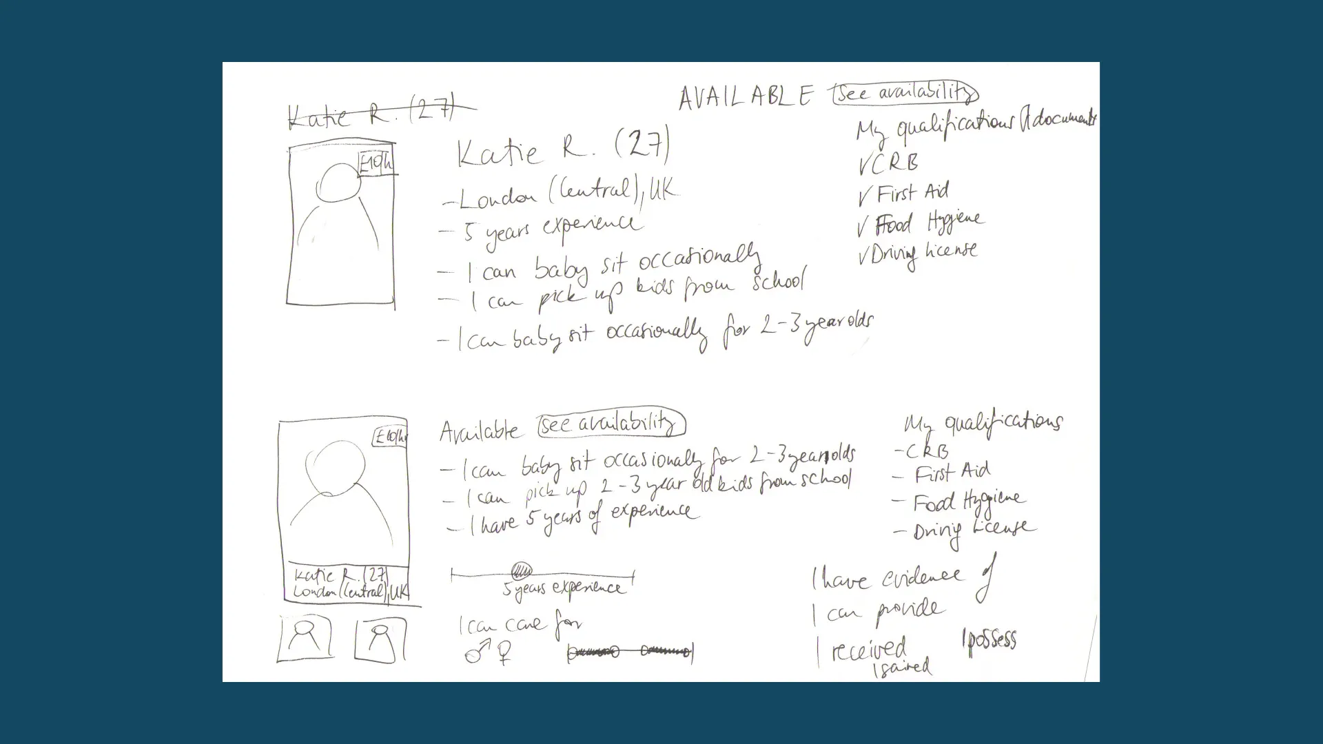
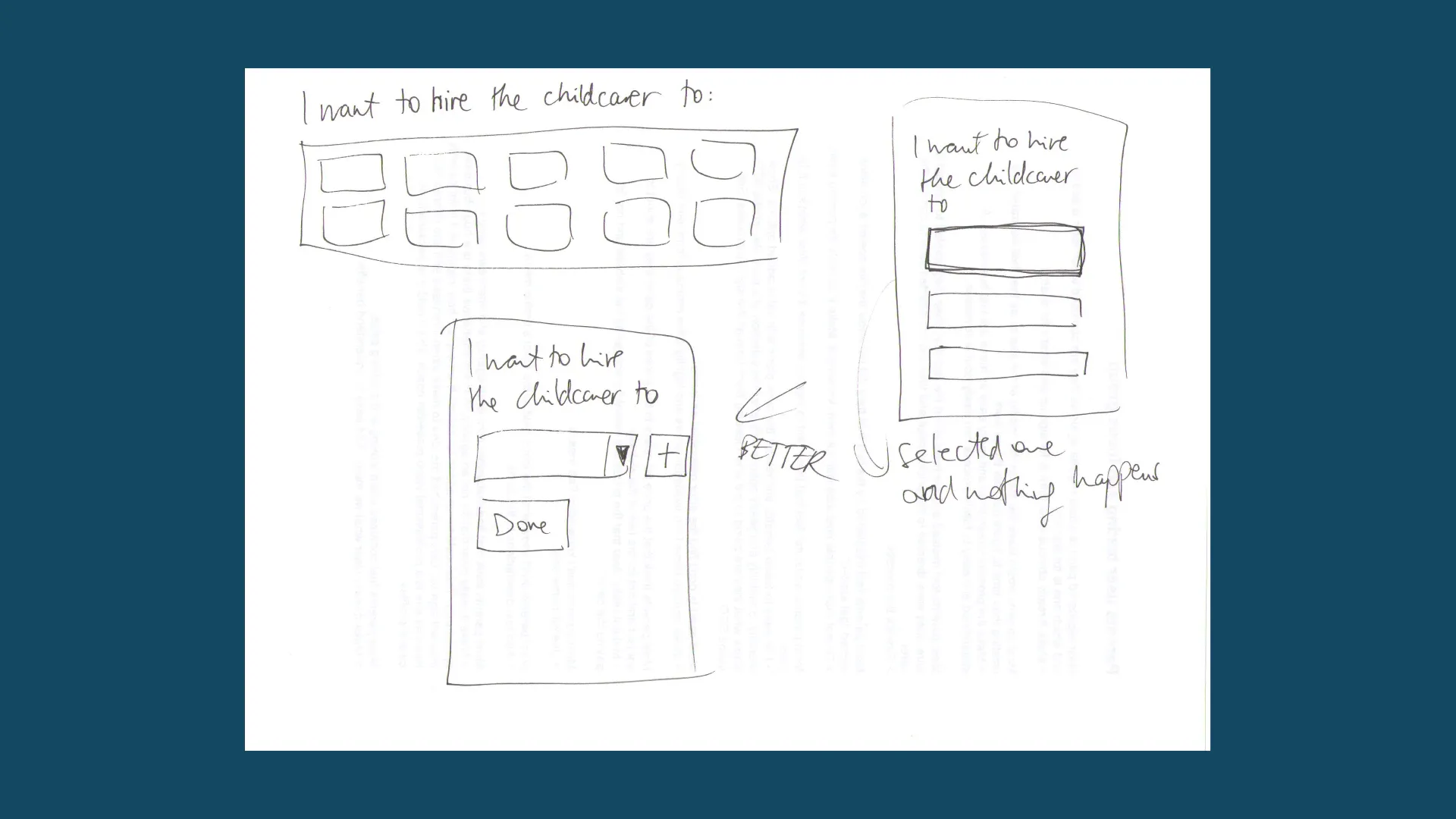
UX / Sketches
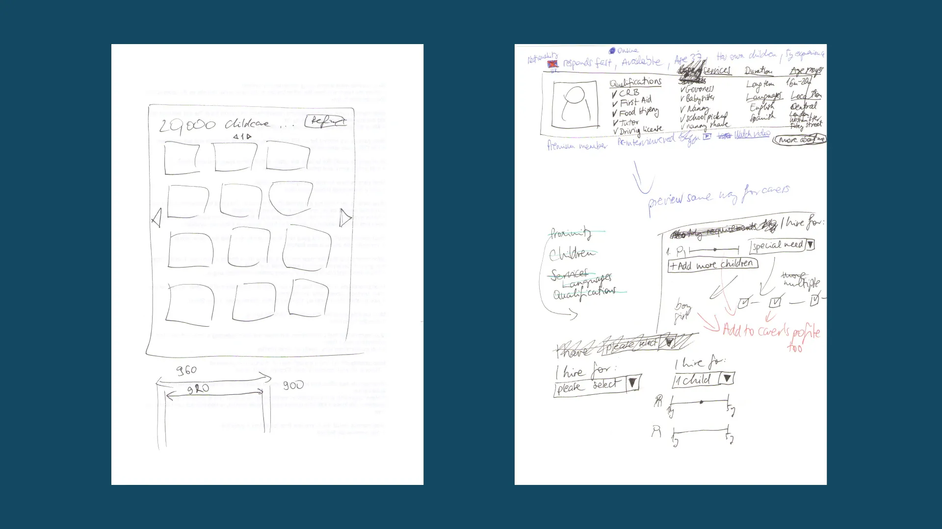
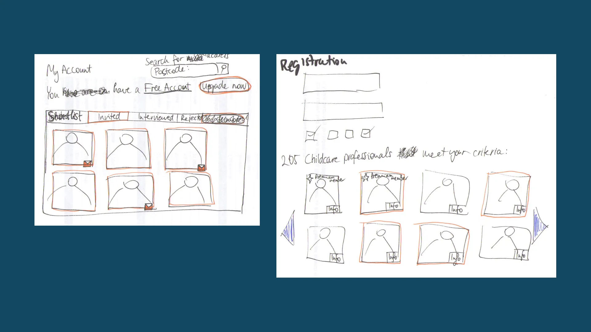
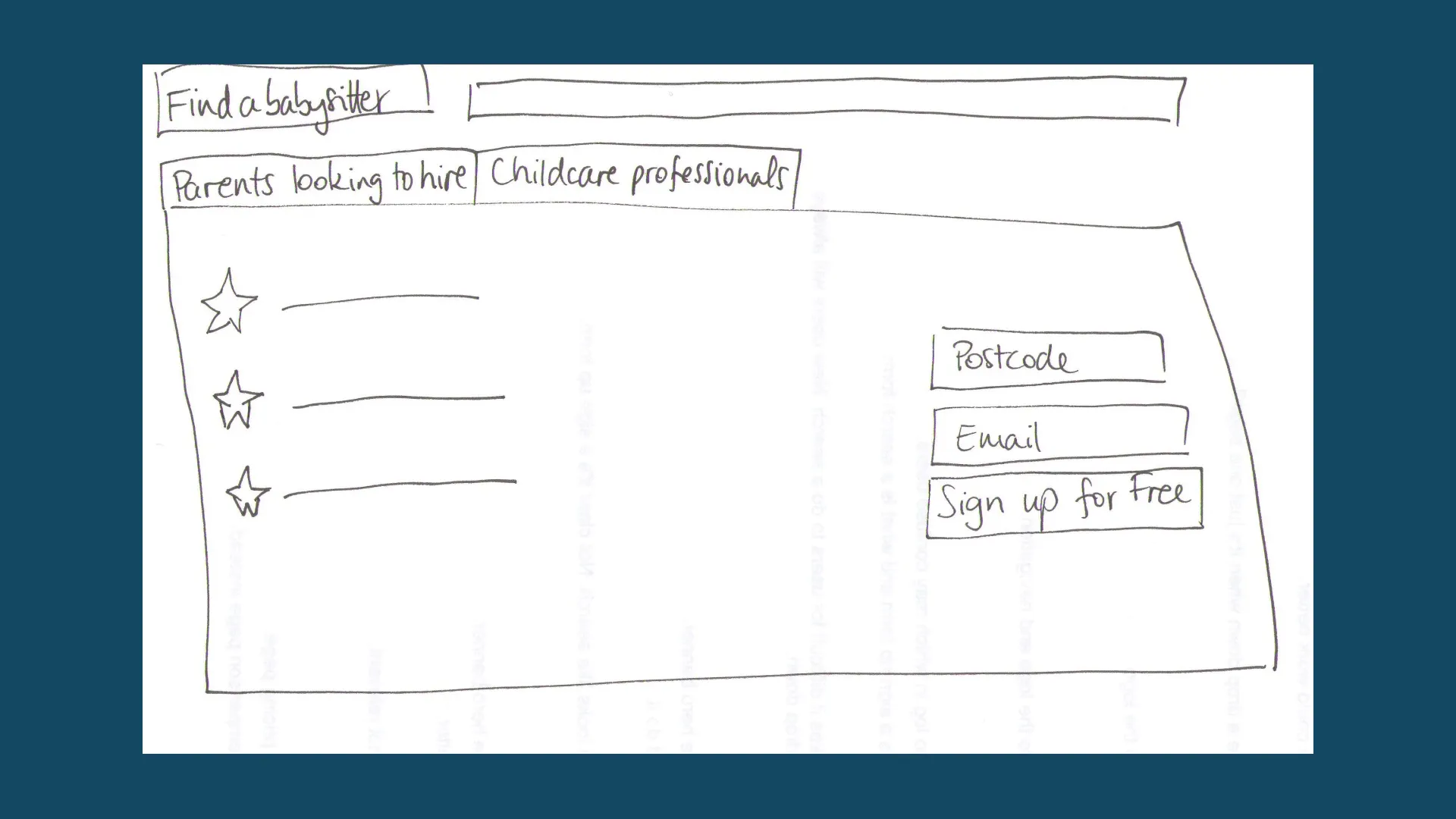
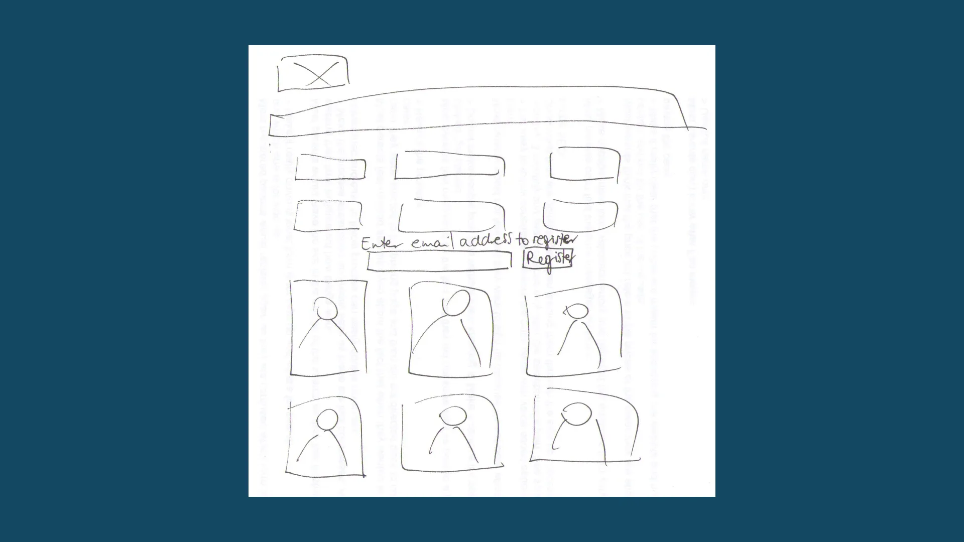
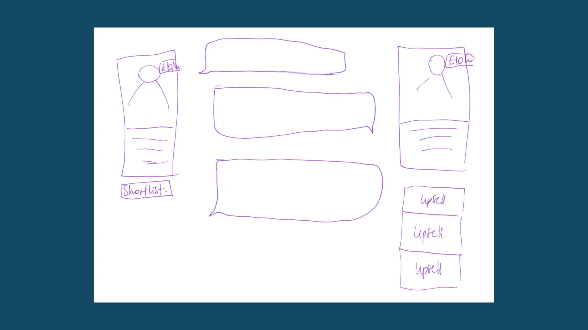
UX / Wireframes / Desktop
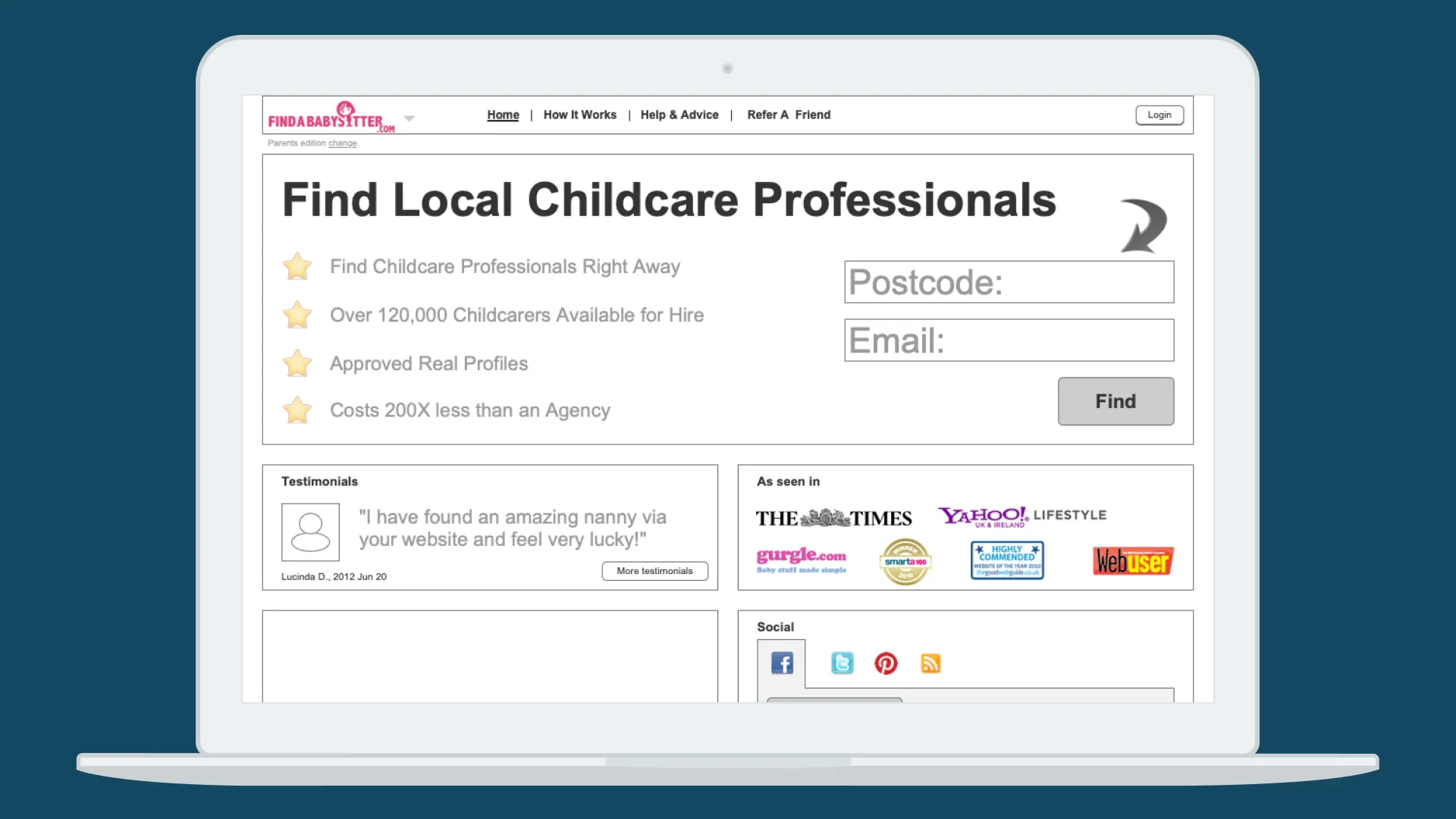
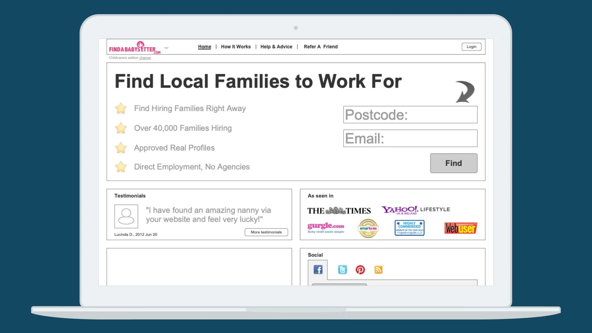
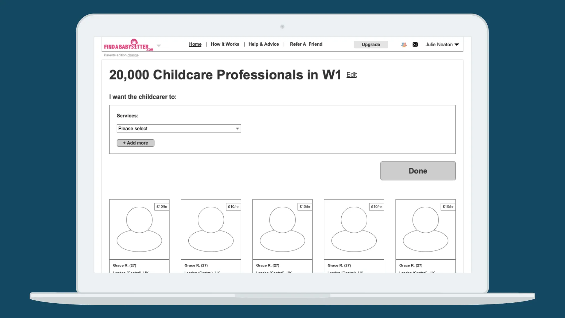
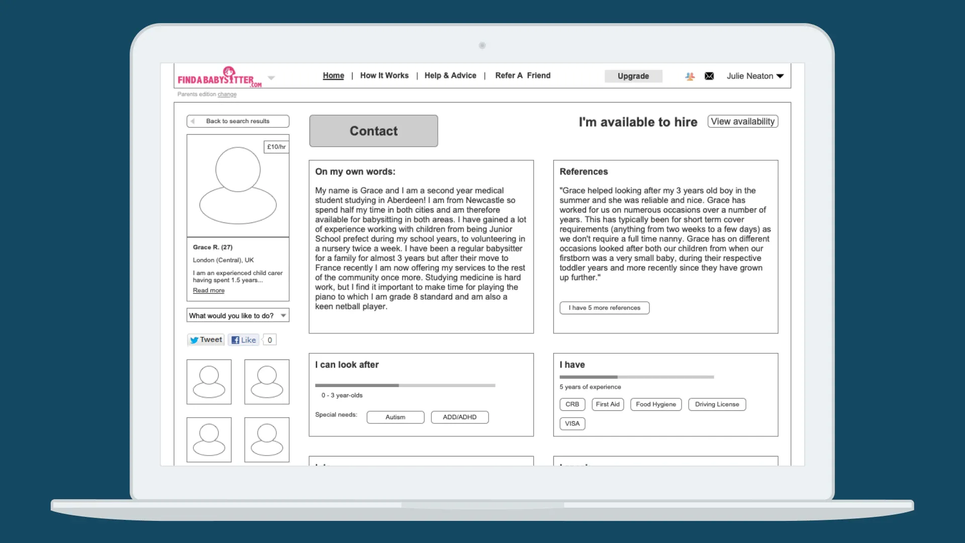
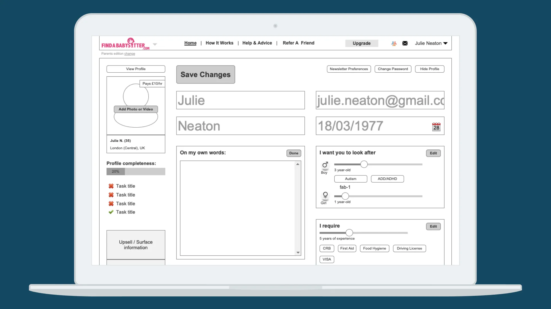
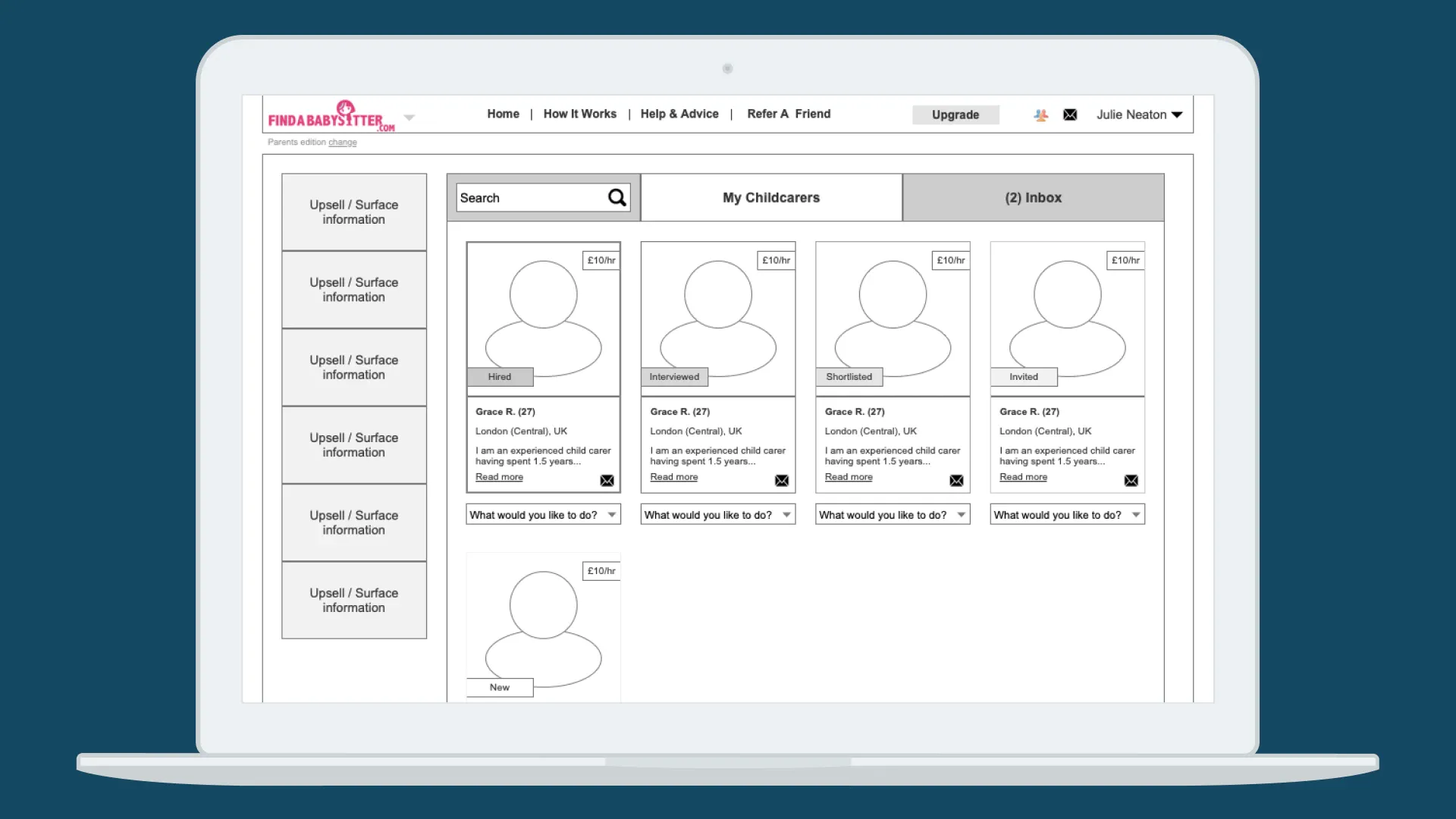
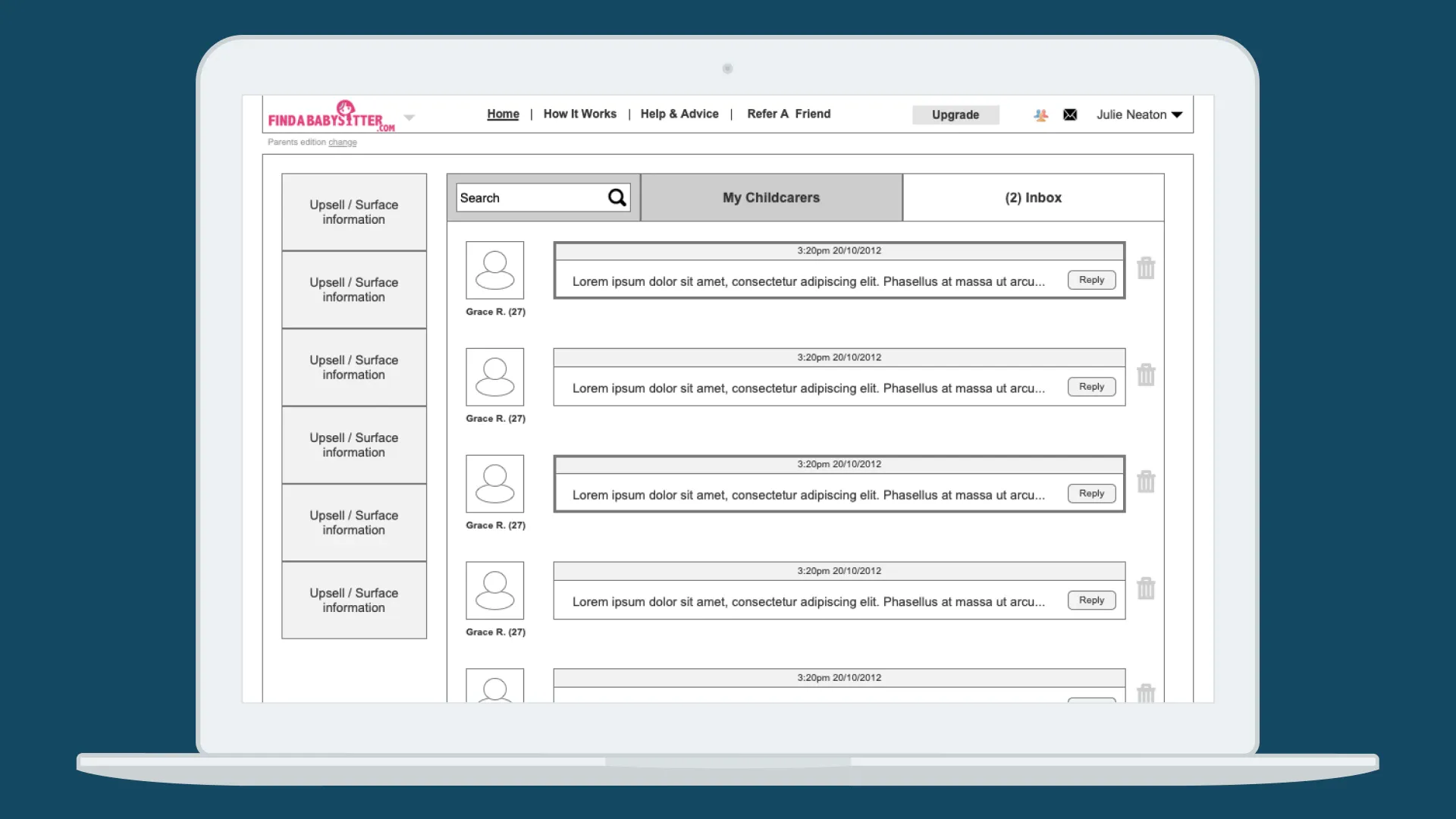
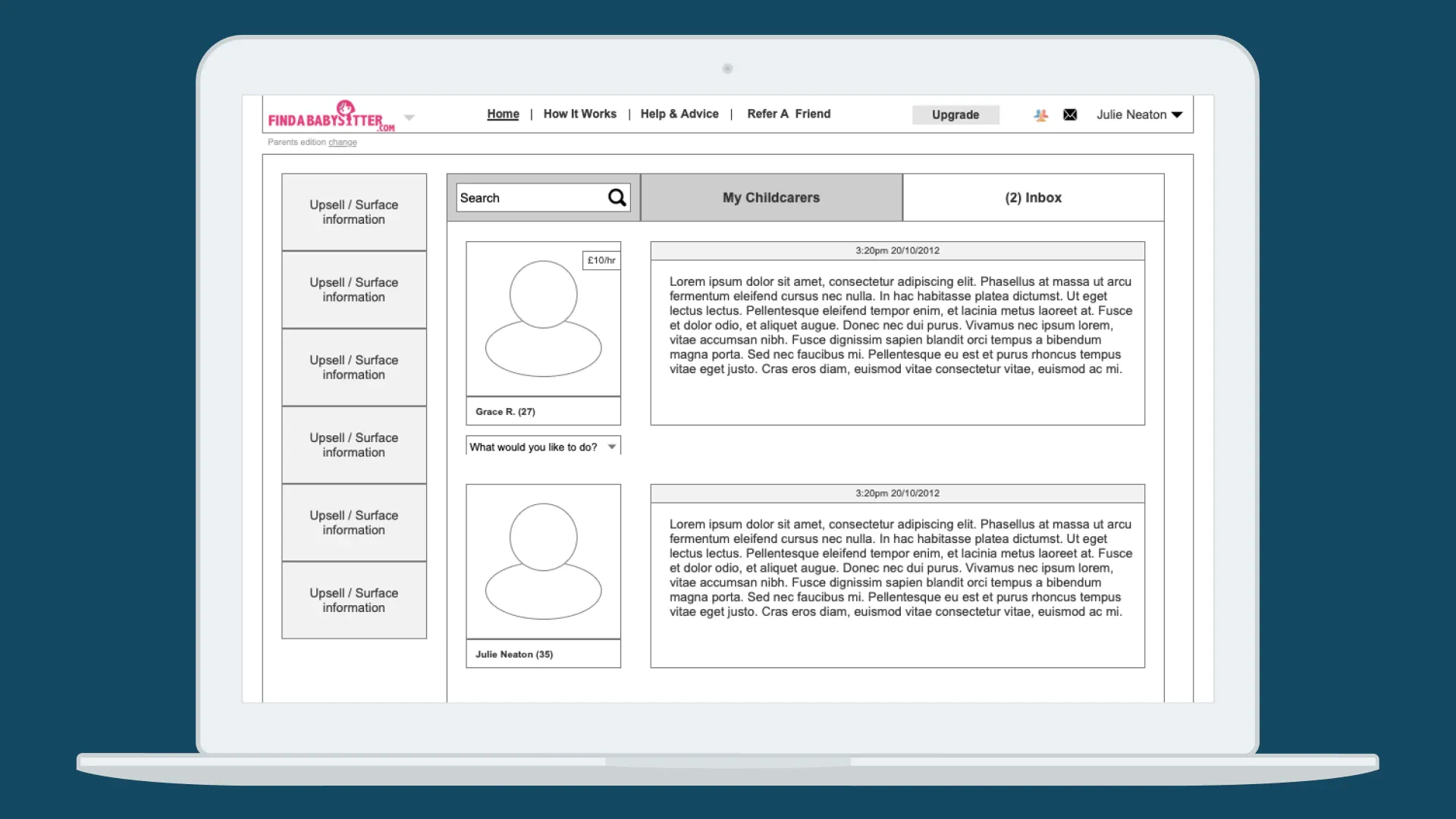

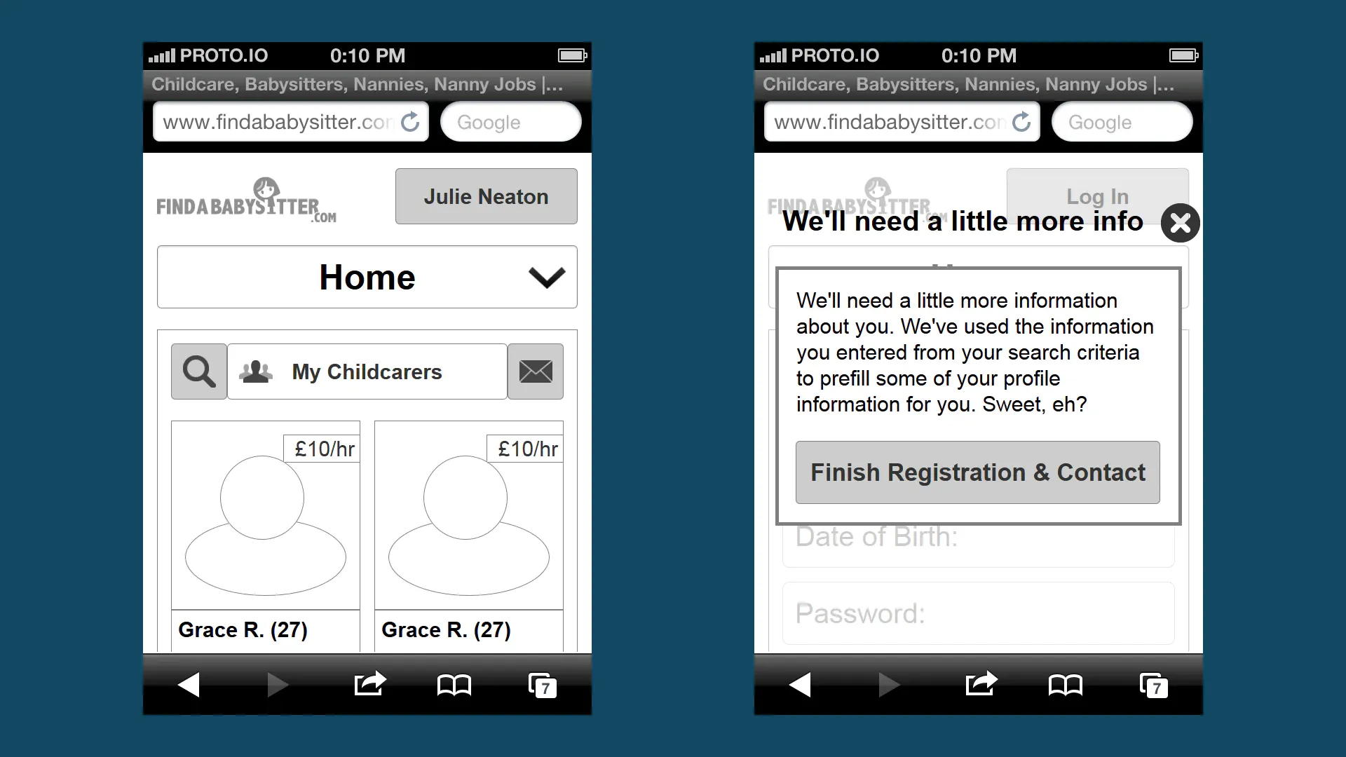
UX / Wireframes / Mobile
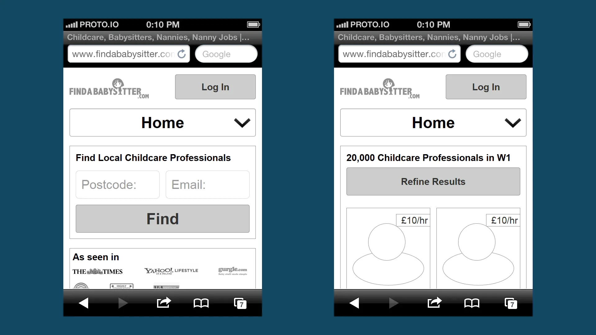
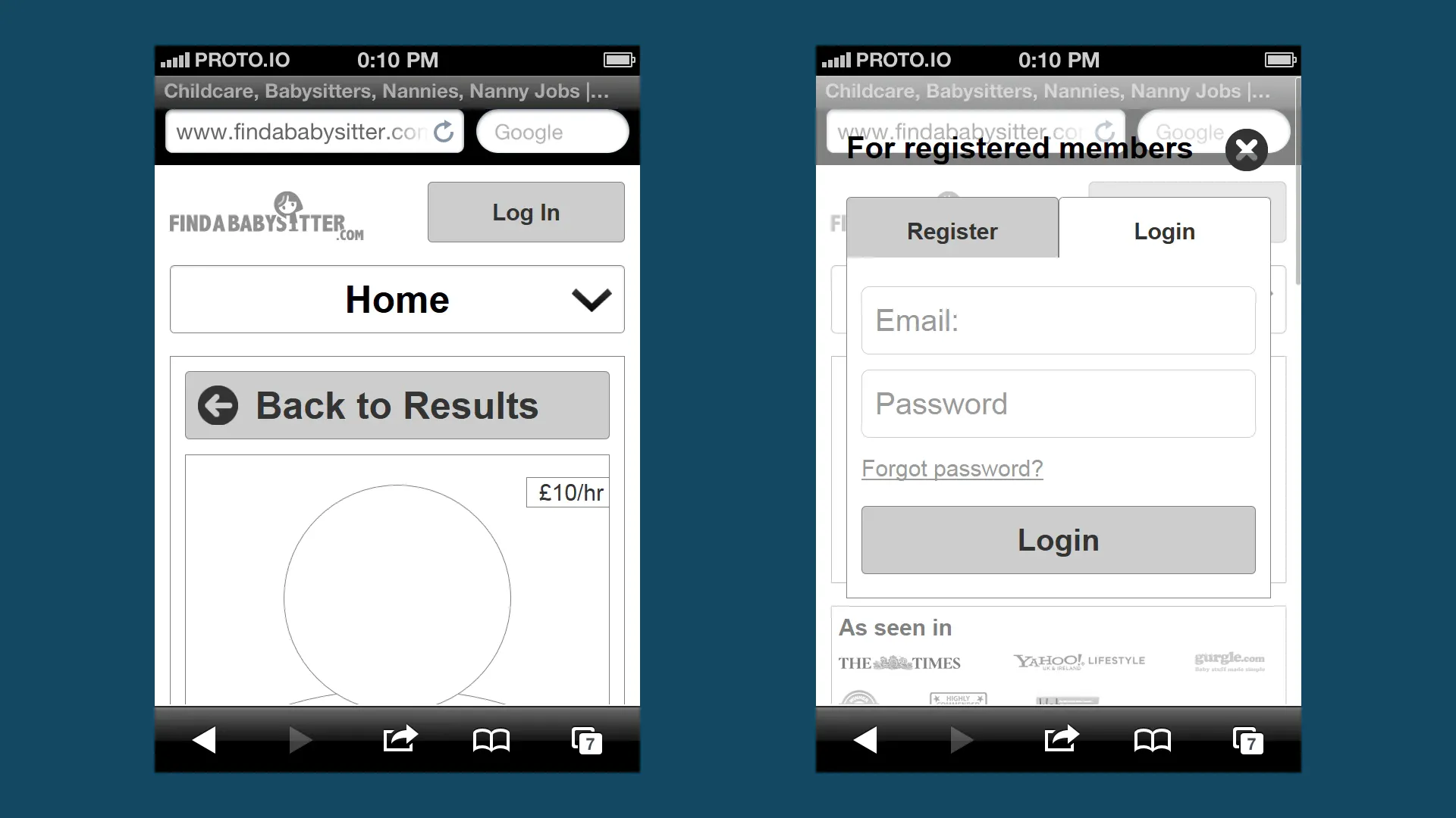
SERVICES
- Focus Group
- User Research
- User Testing
- User Interviews
- Card Sorting
- UX Review
- UX Workshops
- Agile Methodologies
- Stakeholder Presentations
- Sketches
- Information Architecture
- User Flows
- User Journeys
- Responsive UX/UI Design
- Mobile UX/UI Design
- Wireframes
- CRO (Conversion Rate Optimization)
- Design Handoff
- Instructional Design
INDUSTRY
C2C eCommerce / Childcare
AGENCY
CREDITS
All logos, product and company names included are trademarks of their respective owners and subject to their own copyright laws.
